Hi designers!
Welcome to the very first edition of CUxD newsletter – a curated set of design learnings, inspiration, resources, and tips. I’m Clément, Internal Outreach Lead, and I’ll be writing to you on behalf of CUxD every week.
If you’re not familiar with CUxD (Cornell User Experience Design), we’re a centralized community for UI, UX, and product designers at Cornell. We learn and grow together both professionally and socially!
Want to be more learn more about UX design?
Learning time
Every week, we’ll explore a topic in design. Have you ever wondered why certain UI design patterns are named the way they are? In this edition, we’ll trace the history behind these component names to uncover the reasons they’ve stuck around.
Let’s take a look at a few common ones:
1. Radio buttons
Radio buttons let users select a single option from a list. They’re commonly seen in online forms or surveys. The key distinction between radio buttons and other elements, like drop-downs or checkboxes, is that only one option can be selected at a time.
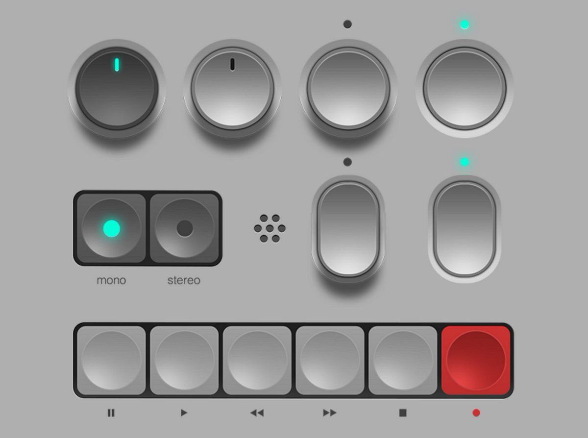
The name “radio buttons” originates from the physical buttons used in older radios to select stations. When you pressed one, the others would pop out, leaving only the pressed button in a “pushed in” position. This is exactly how digital UI radio buttons behave today.
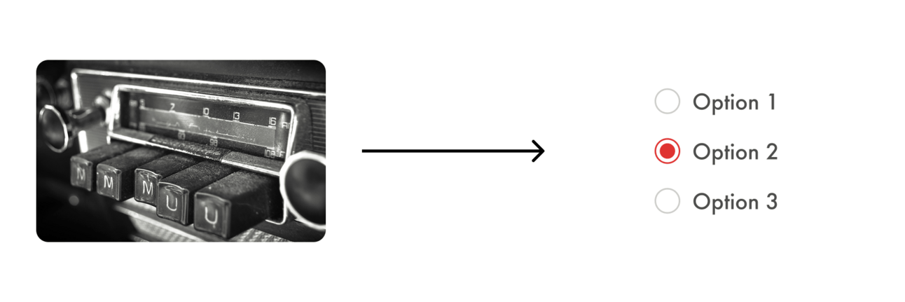
Radio buttons (analog) to radio buttons (UI component)
2. Breadcrumbs
Breadcrumbs are a navigation tool that helps users trace their path through the hierarchical structure of a website.
The term “breadcrumbs” comes from the fairy tale Hansel and Gretel, where the characters leave a trail of breadcrumbs behind them to find their way back. In the same way, UI breadcrumbs show users the steps they’ve taken within the site’s structure.
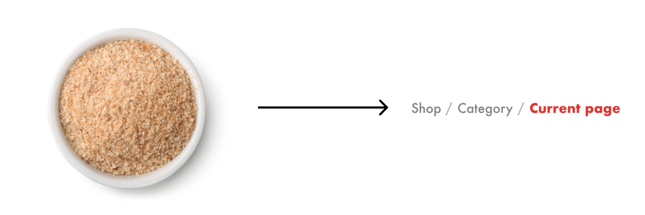
Breadcrumbs (food) to breadcrumbs (UI component)
3. Tabs
Tabs allow users to switch between different sections within a single screen. Typically displayed as a horizontal bar, each tab represents a distinct section.
The concept of tabs comes from physical file folders, where individual sections are marked by tabs to help you quickly flip between them.
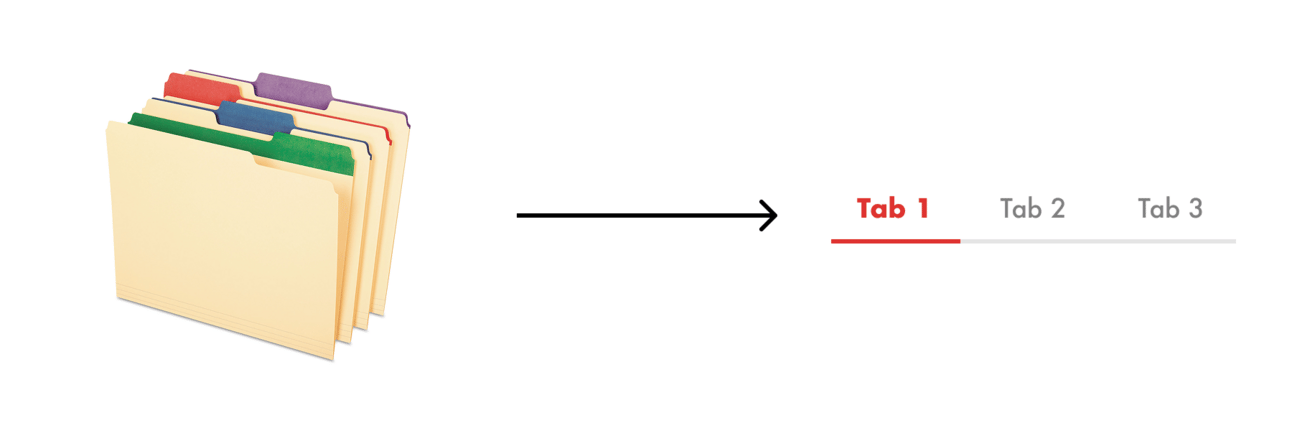
Tabs (in folders) to tabs (UI component)
4. Carousels
Carousels are dynamic components used to showcase multiple pieces of content within a single section. They typically contain content image, text, or other media, and are laid out in a horizontal row.
The name “carousel” is inspired by the traditional carnival ride where multiple items, like horses, move in a circle. Just like the ride, UI carousels allow users to cycle through the collection content in a circular fashion.
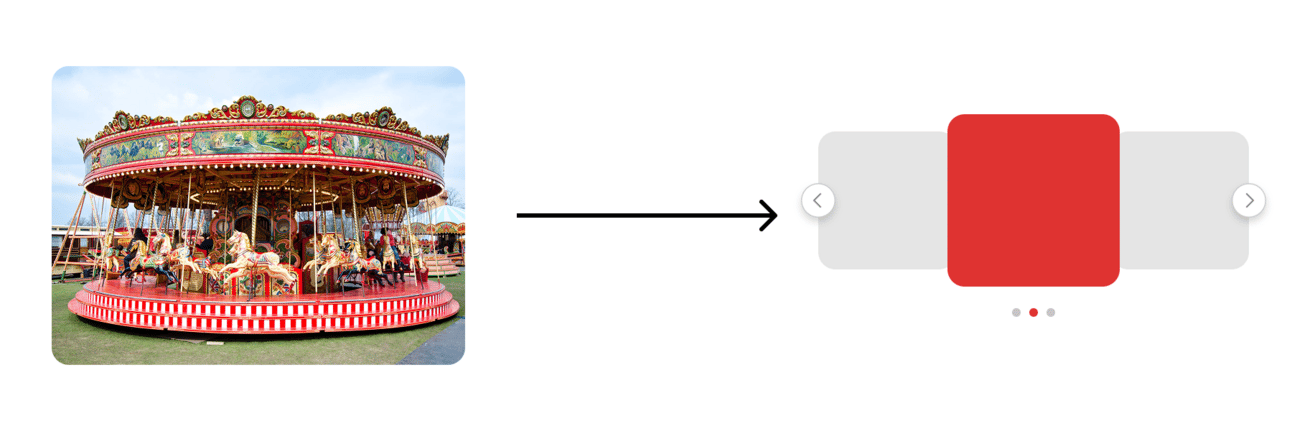
Carousel (in theme parks) to carousel (UI component)
Learn more
If you’re interested in learning more the names of user interface design patterns, here’s a good list. And to learn more about about where specific UI or computer parts come from, check out this article by Julia Ku.
Internship opportunities
Brand Design Intern @ Ripple
New York, $28 - $31 / hrExperience Design Intern @ Dow Jones
New York, $25 / hrUX Design Intern @ Oracle
Remote, $18.99 to $53 /hrProduct Design Intern @ Asana
NYC, $57.50 / hr
Advice from a fellow designer
About
Erica Lee, Information Science/UX, from Queens, NY
Fav Figma shortcut
Shift-A or P (pen tool)
Previous work experience
Erica previously worked as a Contract Product Designer at SoFi and as a Project Manager/UX Lead at AlgoLink. She’s currently a Contract Product Designer at Lenovo and an incoming Product Design Intern at Apple.

Proudest design project
“I really enjoyed the work I did on SoFi—it was my first consulting project on DCC, and I had the opportunity to work with some amazing designers to create an accessible and tailored financial management platform for SMBs (Small & Medium-sized Business Owners).“ You can see more about Erica’s work for SoFi here.
Advice
“Recruiting can be tough! Stay on top of applying early (within 1-2 days of job posting, so set those notifications), network with Cornell alum who work at companies you want to work at, chat with people who were in your position and were able to land offers to see what they did, set up mock interviews with experienced designers, and most importantly, don’t get discouraged :)”
Design inspiration
Some cool designs to for your dopamine hit.
That’s all for this week!
Have any feedback or want to see something on the newsletter next week? Email us at [email protected] or reply directly to this email.
See you soon,
Clément @ CUxD
