Hi designers!
Welcome to the 15th edition of CUxD newsletter for Fall 2025 – a curated set of learnings, inspiration, resources, and tips. We’re Clément & Sia, Internal Outreach Leads, and we’ll be writing to you on behalf of CUxD every week.
If you’re not familiar with CUxD (Cornell User Experience Design), we’re a centralized community for UI, UX, and product designers at Cornell. We learn and grow together both professionally and socially!
Want to be more learn more about UX design?
Table of Contents
Iterating Visual Design
Every week, we’ll explore a topic in design. In this edition, we’ll talk about visual design iterations and how incremental changes can make a design look unique!
Step 1 – Unstructured layout
The initial layout feels loose and unstructured, with elements scattered across the card. Large empty spaces and the lack of visual hierarchy make it hard to understand what’s most important or how elements relate to each other.

Step 2 – Creating structure
Adding a border establishes a clear boundary and turns the content into a cohesive visual unit. Grouping icons closer to their labels improves readability, while turning “Book” into a button makes the call to action more distinct and inviting.

Step 3 – Strengthening Hierarchy
By introducing a defined card boundary and tightening the grouping of icons and labels, the design feels more intentional and easier to scan. The “Book” button now clearly signals interaction, creating a stronger visual and functional hierarchy.

Step 4 – Improving Readability
Refined typography and tighter spacing make the content easier to read and more balanced. The new text hierarchy helps users scan labels, titles, and descriptions quickly, while the addition of feature pills visually organizes information into digestible chunks.

Step 5 – Final Polish
Color and shape refinements bring the final polish. A lighter card and dimmer background create contrast and focus, rounded corners make the card feel more approachable, and bolder button text strengthens the visual emphasis on the primary action.

Internships
Seattle, WA, $34 – $42 / hr
Costa Mesa, CA
San Francisco Bay Area, $41 – 48 / hr
Redwood City, CA, Seattle, WA, $19.62 – $53/ hr
Olathe, KS
Advice from a fellow designer
About
Funmi Olukanmi, Info Sci ‘26, Palmdale,CA
Fav Figma shortcut
cmd + option + c / cmd + option + v (copy and paste properties!)
Previous work experience
Product Design Intern @ Atlassian, Product Designer @ Cornell AppDev

Proudest design project
I designed a "Compare Menus" feature for Eatery that streamlined the process of comparing multiple dining menus at once to help users make faster dining decisions. I reimagined the comparison experience, focusing on interactions where users could compare menus sequentially rather than side-by-side. This experience deepened my appreciation for how small interaction details can elevate user experiences and improved my interaction design skills.
Advice
Don’t stress about getting everything right. It’s important to release the pressure to be perfect and embrace curiosity. It’s easy to get caught up in chasing the perfect job or polishing a project until it feels “perfect,” but the best growth happens when you try new things, take risks, and allow yourself to be be imperfect before you become great
Design inspiration
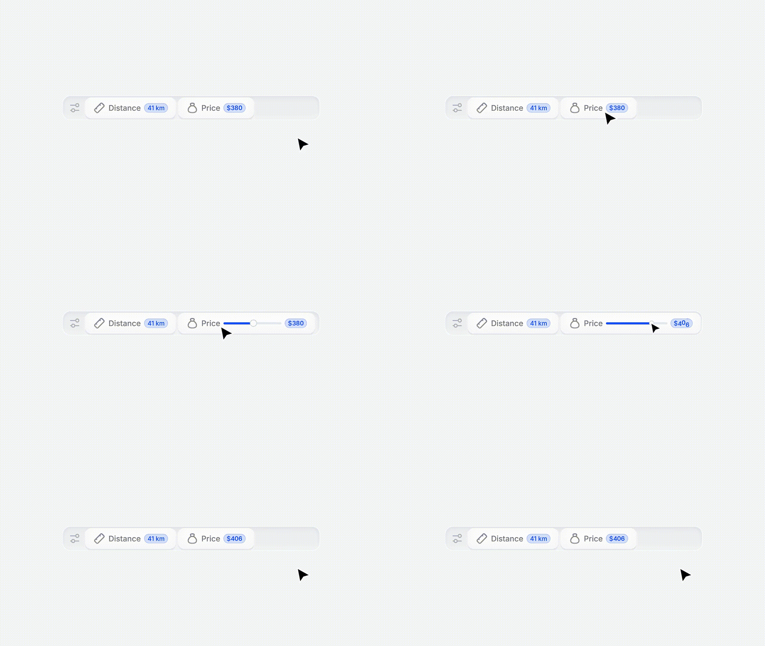
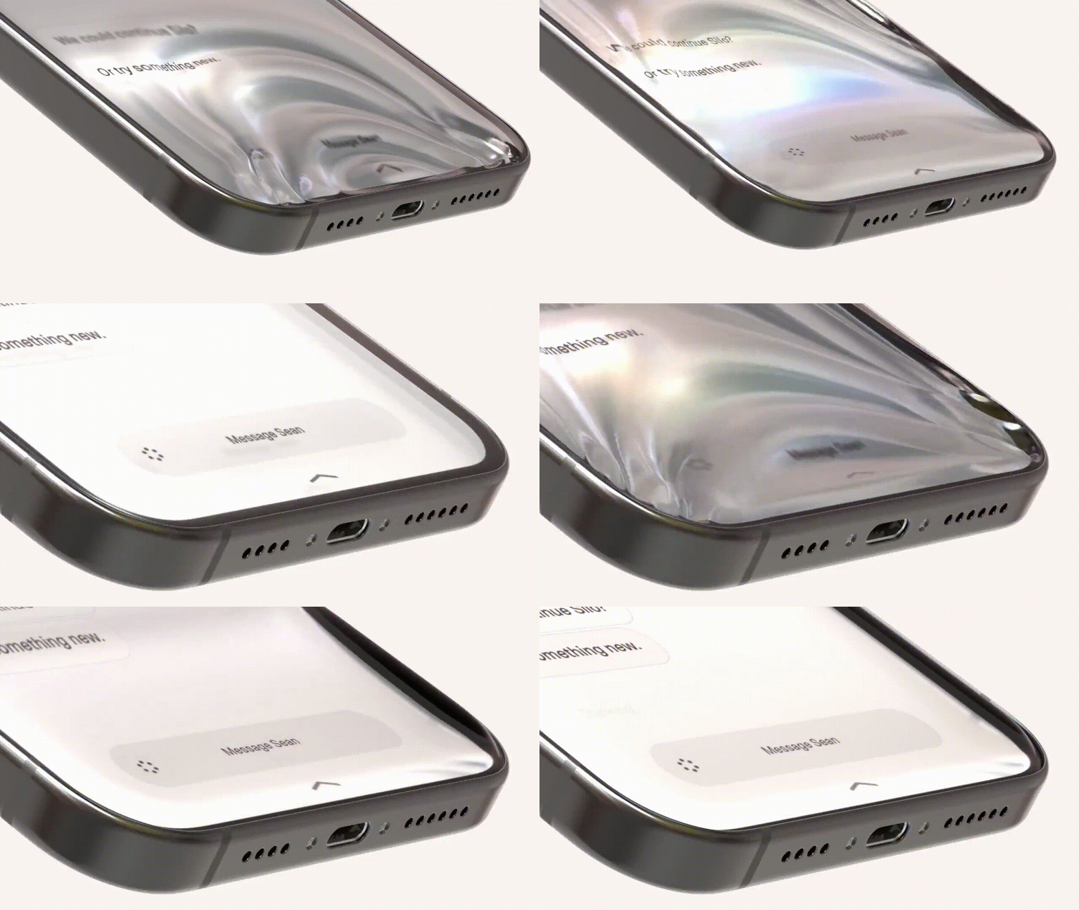
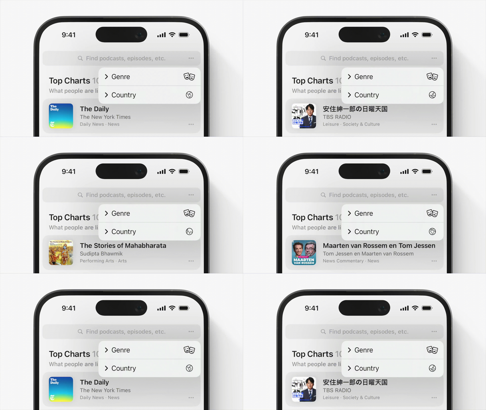
Some cool designs for your dopamine hit.
Outro
That’s all for this week!
Have any feedback or want to see something on the newsletter next week? Email us at [email protected] or reply directly to this email.
See you soon,
Clément & Sia @ CUxD

