Hi designers!
Welcome to the 12th edition of CUxD newsletter for Fall 2025 – a curated set of learnings, inspiration, resources, and tips. We’re Clément & Sia, Internal Outreach Leads, and we’ll be writing to you on behalf of CUxD every week.
If you’re not familiar with CUxD (Cornell User Experience Design), we’re a centralized community for UI, UX, and product designers at Cornell. We learn and grow together both professionally and socially!
Want to be more learn more about UX design?
Table of Contents
Color theory
Every week, we’ll explore a topic in design. In this edition, we’ll talk about color theory principles.
What is color theory
Color theory is the framework that helps designers understand how colors work together to create harmony and evoke emotions. By applying it, you can craft visually impactful designs, guide user experience, and express brand personality more effectively.
Introduction to the Color Wheel
The color wheel is a key tool in color theory. It organizes colors into three main groups:
Primary colors include red, yellow, blue. They are the foundation for all other colors.
Secondary colors include orange, green, violet. They are created by mixing two primaries.
Tertiary colors include red-orange, yellow-orange, yellow-green, blue-green, blue-violet, and red-violet. They are formed by mixing a primary color with a secondary color.

Image source: Nielsen Norman Group
Color harmony
Color harmony shows how colors work together to create balance in a palette:
Analogous colors sit next to each other on the wheel, creating a calm and unified look through low contrast.
Complementary colors are opposite on the wheel, producing strong contrast and high energy.
Split-complementary uses a base color and the two on either side of its opposite, creating contrast, but one that feels softer than complementary.
Triadic colors are evenly spaced around the wheel, making palettes that are vibrant yet balanced.
Monochromatic harmonies use variations of one hue, resulting in a clean and cohesive look with subtle contrast.

Image source: Nielsen Norman Group
Accessibility in color
About ~300 million people worldwide have Color Vision Deficiency and it is important to use color in an accessible way to make interfaces usable for people with diverse abilities.

Image source: Komodo Digital
Avoid tricky combos like red/green or blue/purple, which are hard for users with color vision deficiencies.
Check contrast with WCAG standards (4.5:1 for normal text, 3:1 for large) with tools like Stark, Coolors and Color Oracle.

Image source: Komodo Digital
Quick Tips:
Use contrast but not too much; avoid pure black
#000000) or pure white#FFFFFF).Never rely on color alone. Add labels, icons, or patterns to reinforce meaning.
Stay consistent so buttons, links, and headings are instantly recognizable
Internships
Playa Vista, $20 - $50 / hr
US, $30 / hr
NY, $24 - $63 / hr
Palo Alto
Digital Operations Intern @ Dow Jones
NY, $25 / hr
Advice from a fellow designer
About
Emma Shen, Info Sci 2024, UX Concentration, from San Francisco, CA but now living in NYC
Fav Figma shortcut
Create a component: Option + Command + K and Auto Layout: Shift + A
Previous work experience
Currently a Technology Strategy Analyst @ Deloitte
Prev experience…
Cofounder/president/PM/consultant @ DCC
Designer @ DTI
Designer @ CUSD
Product design intern @ Instabase
Product management intern @ Terra Quantum

Proudest design project
Recently, I was selected for an innovation competition in Texas called StartUp Deloitte. With my incredible team, we dove into a problem statement shaking the Retail industry: “Consumers are overwhelmed with options and underwhelmed by relevancy.” To address this, we designed and pitched Styld—an AI-driven, hyper-personalized "For You Page" made to cut through the noise and deliver truly relevant product recommendations to every consumer.
The impact of Styld was immediately evident: our solution resonated strongly with both peers and judges, earning us the “Crowd Favorite” award. Having designed the prototype in Figma, it was an incredibly proud and energizing experience. I will never stop designing!
Advice
To every aspiring entrepreneur and anyone eager to shake things up: don’t wait for change—create it! Start a club! The summer after my freshman year, I co-founded Design Consulting at Cornell, and it was hands-down one of the most exciting and fulfilling things I’ve ever done. Starting a club is like launching your own startup, but with the freedom to experiment, learn, and grow alongside your peers, with the support of the university, and the protections of being a student. You’ll build real leadership and problem-solving skills, rally others around a shared vision, and make a tangible difference in your community. If you want to leave your mark and turn your ideas into reality, take the leap—start something of your own!
Design inspiration
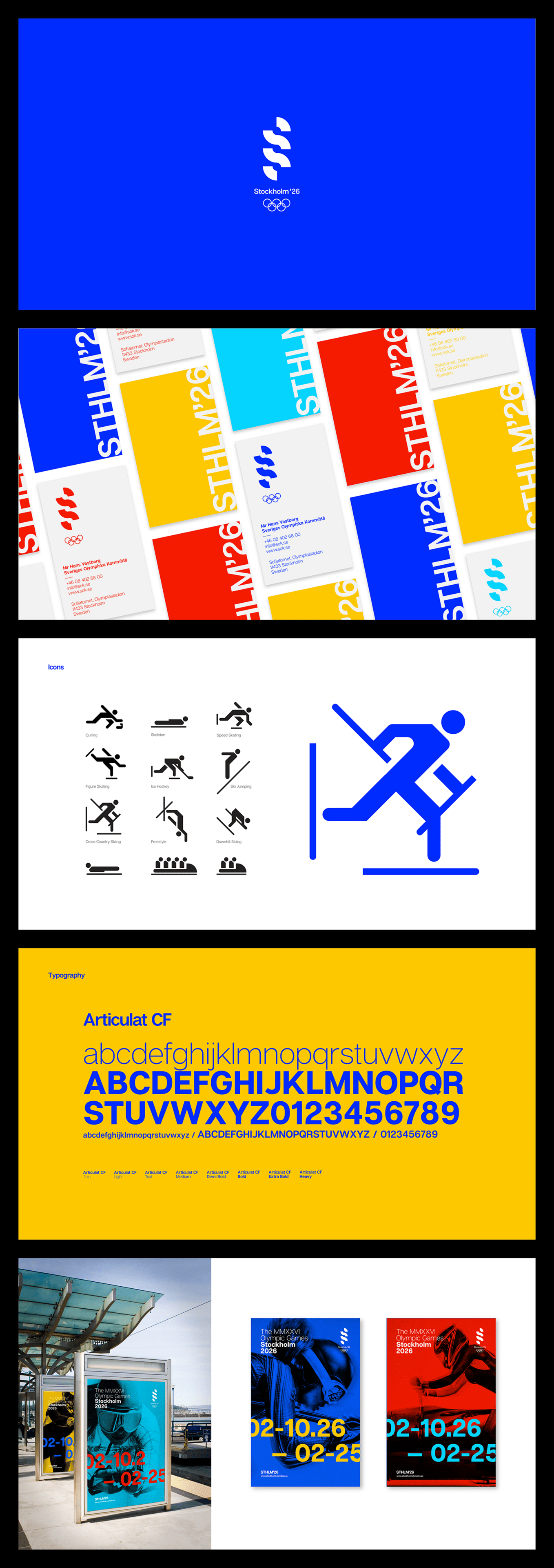
Some cool designs to for your dopamine hit.
Outro
That’s all for this week!
Have any feedback or want to see something on the newsletter next week? Email us at [email protected] or reply directly to this email.
See you soon,
Clément & Sia @ CUxD


