Hi designers!
Welcome to the 21st edition of CUxD newsletter – a curated set of learnings, inspiration, resources, and tips. We’re Clément & Sia, Internal Outreach Leads, and we’ll be writing to you on behalf of CUxD every week.
If you’re not familiar with CUxD (Cornell User Experience Design), we’re a centralized community for UI, UX, and product designers at Cornell. We learn and grow together both professionally and socially!
Want to be more learn more about UX design?
Table of Contents
Gestalt Principles
Every week, we’ll explore a topic in design. This week, we are looking at Gestalt principles. Gestalt principles explain how the human mind organizes visual information and stimuli into patterns. As designers, we can use this knowledge to build clear hierarchy, reduce noise, and guide attention.
Proximity
Elements close together are perceived as related or part of a group. Group related elements so users know they belong to the same section.
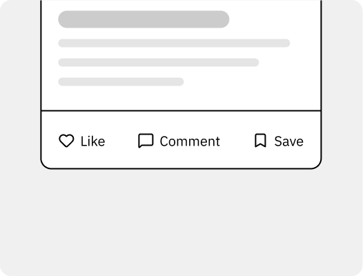
Placing icon + label closely so they’re seen as a single interactive element.
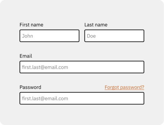
Grouping related form fields so users know they belong to the same section.
Similarity
Items sharing color, shape, size, or type are interpreted as belonging together. Consistent styling typically signals common function.
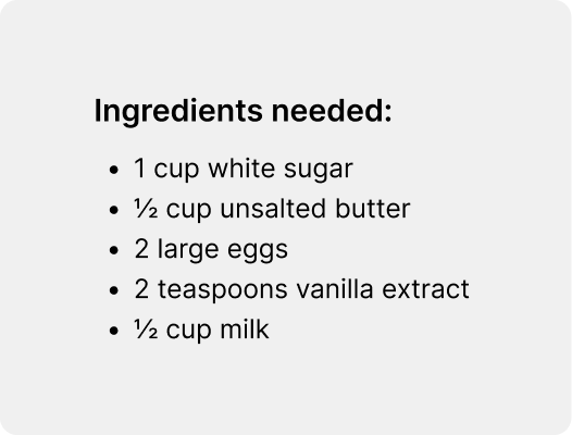
List items with identical typography and bullet style.
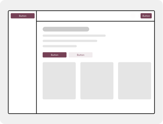
Using the same button style for all primary actions to signal importance.
Continuity
Eyes prefer smooth, unbroken paths. Clean alignment and predictable flows encourage effortless scanning.
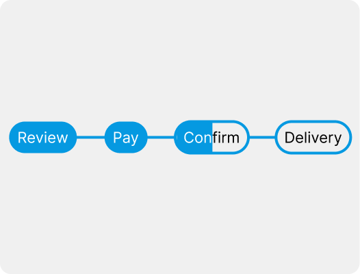
Step-by-step checkout process shown as horizontal progress bar.
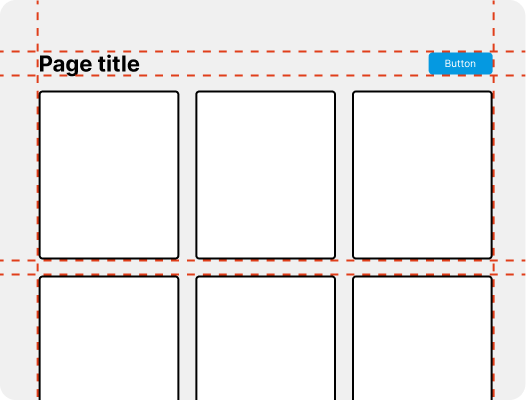
Arranging content cards along a consistent alignment for easy scanning.
Closure
Viewers complete incomplete shapes. Partial outlines can suggest containers.
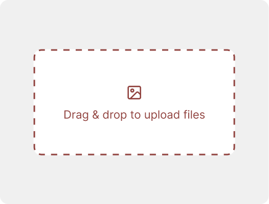
Dashed outlines suggesting a drag & drop upload area.
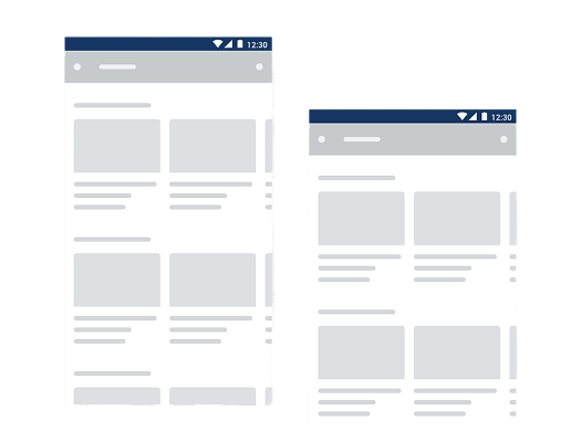
Skeleton loading screens implying final screen layout.
Figure–ground
People separate objects (figure) from their surrounding area (ground). Contrast in size, color, blur, or elevation improves comprehension.

Hero text over an image with a gradient + blurred overlay.
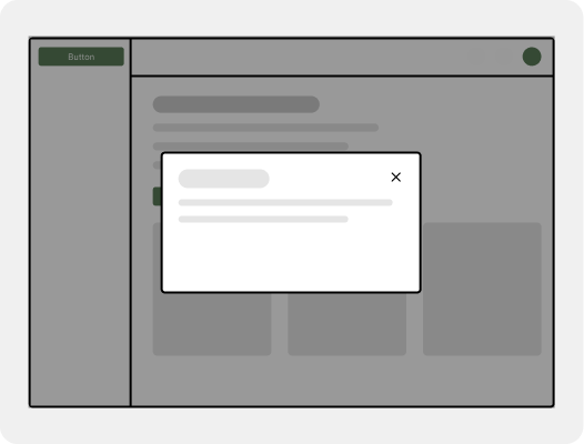
Modal dialogs that pop out from a dimmed background to signal focus.
Common region
Elements inside the same closed area are perceived as related. For example, content inside the same card, panel, or tab reads as a single unit.
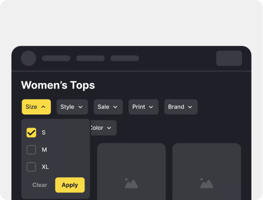
Filters grouped together inside a sidebar panel.
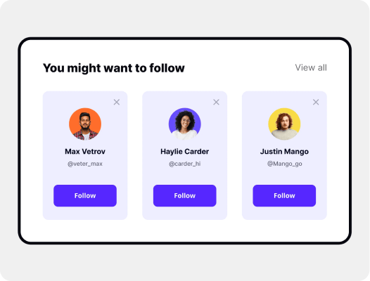
Cards grouping related product info inside.
Connectedness
Elements connected by lines or shapes are perceived as related. Labels and inputs, or icons and text, often benefit from this cue.
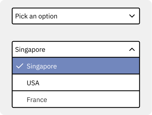
Dropdown arrow visually tied to its opened/closed state.
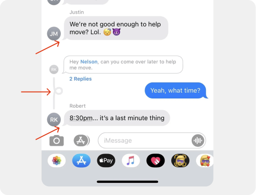
Chat bubbles linked with a tail to the user avatar and interconnected with replies.
Prägnanz
The mind simplifies complexity. Fewer variations and cleaner geometry tend to produce more stable readings.
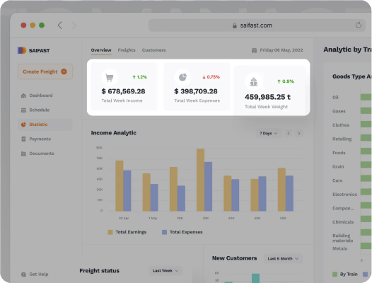
Dashboard showing only top numbers/data at first glance.
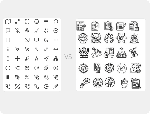
Simple icons instead of detailed illustrations.
Symmetry
Balanced layouts feel organized and quicker to parse. Grids and consistent alignment frequently support this effect.
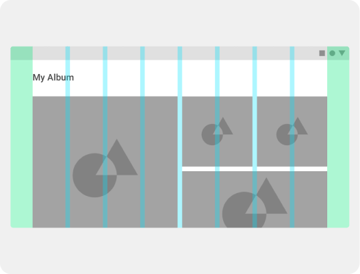
Balanced grid layout where every piece of content is aligned.
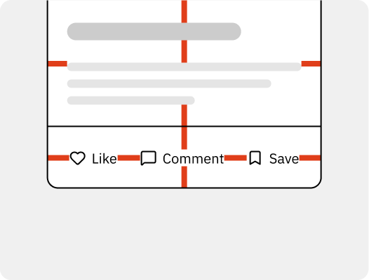
Equal spacing (padding) around elements in a card.
Common fate
Elements moving or changing together appear related. Shared motion across cards or list rows reinforces perceived grouping.
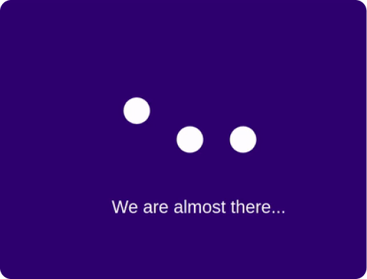
Multiple dots or bars moving in the same direction to indicate progress.
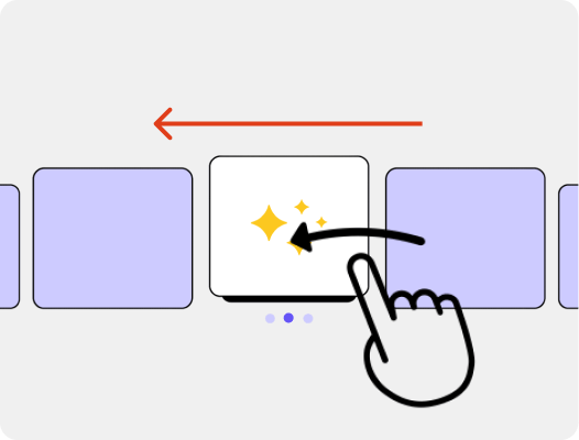
Carousel items sliding together, swiping direction.
Focal point
A distinctive element draws attention first. A single, clear accent commonly anchors the scan.
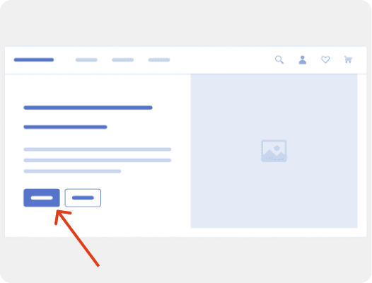
Brightly colored call to action button.
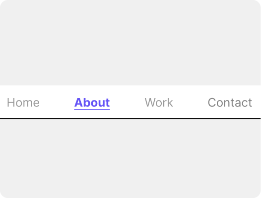
Highlighted active/selected navigation link.
Internships
Mountain View, CA
Dallas, TX, $20 – 23 / hr
Austin, TX
Los Angeles, CA, $20 – 32 / hr
Advice from a fellow designer
About
Naomi Rufian, Information Science Systems and Technology Major, from Long Island
Fav Figma shortcut
Cmd+Shift+R to replace a frame with copied frame
Previous work experience
Product Design Intern at Grand Charter (Series A Startup, backed by Soma Capital, 8VC, Bedrock, etc)
Contract Work at Spotlight (YC S25)
Design Lead at Hack4Impact

Proudest design project
I’m pretty proud of the work I did as the second design hire at Grand Charter. In just two months, I created a design system from scratch, redesigned 2 full platforms, created my own icon set, and even shipped some bug fixes in code, all to prepare for the major launch. While stressful at times and often living in ambiguity, it pushed me to grow quickly, especially in areas I once considered weaknesses, like visual design. The biggest win for me, is learning how to disagree constructively and give clear, thoughtful feedback while collaborating with another talented designer.
Advice
1. Some love to win, and others hate to lose. Find your motivation and lean into it.
2. Be the most interesting person in the room
3. Apply to internships early ;)
Design inspiration
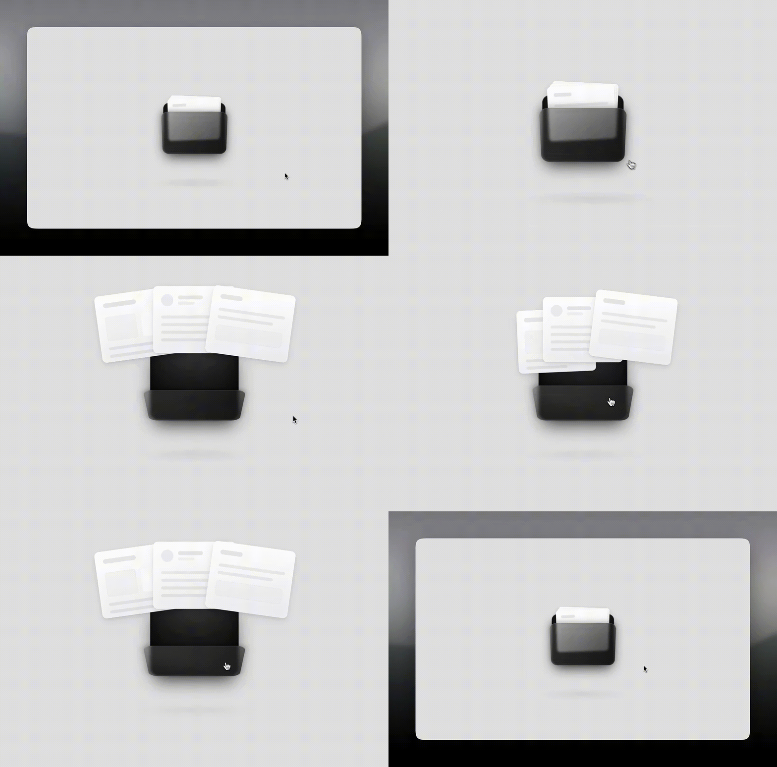
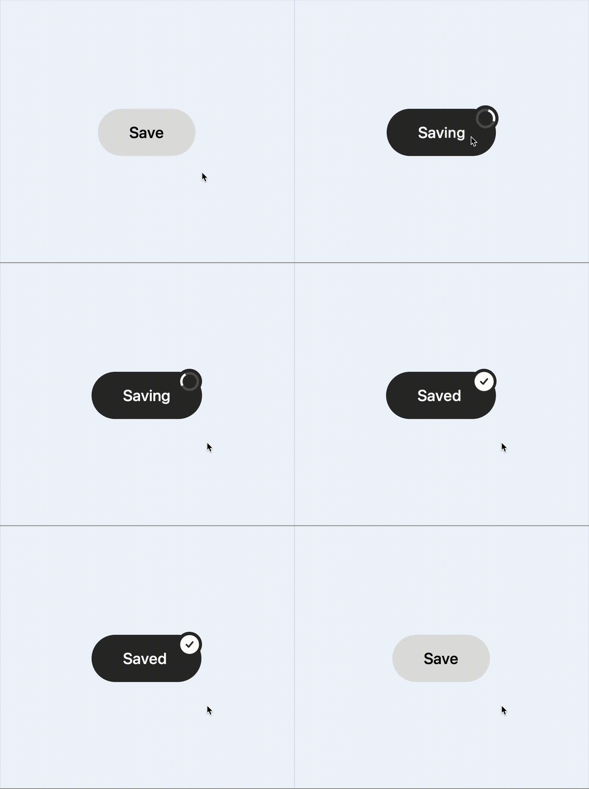
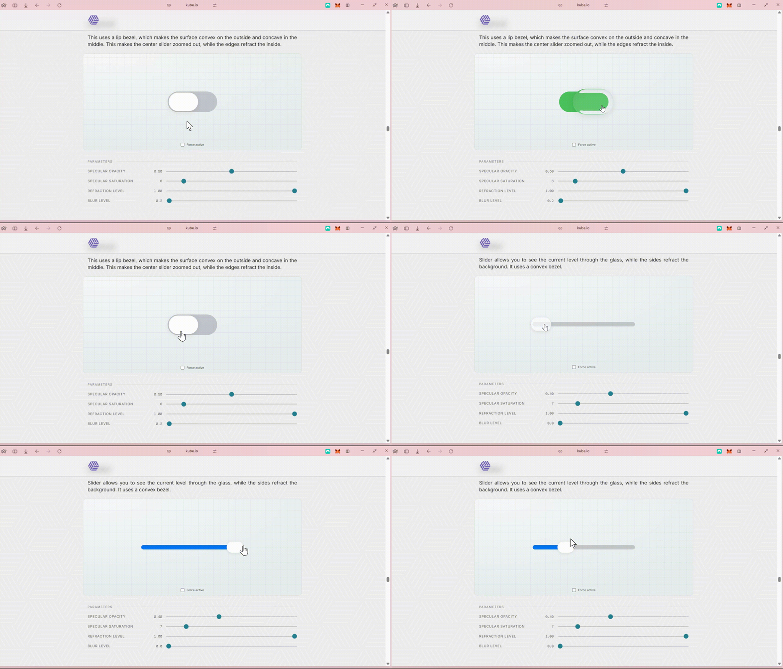
Some cool designs for your dopamine hit.
Outro
That’s all for this week!
Have any feedback or want to see something on the newsletter next week? Email us at [email protected] or reply directly to this email.
See you soon,
Clément & Sia @ CUxD

